3 Reasons Your Logo is Hurting Your Brand
While redesigning my website, I got the chance to go through my archives and decide what to share. I came across a lot of old work I'm embarrassed to show you. I thought it'd be fun to revisit one and point out where I went wrong so you don't make the same mistakes.
The first logo I ever designed professionally. I think I charged the client $50.
The year was 2005, and I was working nights as a custodian at an elementary school in Brooklyn, New York. I was venturing out into the world of freelance graphic design, and I was lost.
As the new kid on the block, I was desperate to work, and eager to please. I did everything the client asked for, and it's evident in the finished product. Yes, you want to give the client what they want, but as the designer, you're also there to guide them with your expertise. I had none.
Single-color logos
Mistake #1: Too Many Colors
A logo, no matter how intricate or complex, should work in a single color. It doesn't have to be a single color, but if placed in an environment where only one color is called for, it should be up to the task. If it doesn't look good in a one-color palette, that means the composition is weak. Fix it. Once you check off that criteria, adding colors shouldn't be a problem, but should still be kept to a minimum.
A simple trick to help you remember: think of your favorite sports team. How many colors do they use?
Mistake #2: Inconsistent Line work
The logo I created uses a variety of thick and thin lines. That in and of itself isn't bad. What's bad is that there's no rhyme or reason. It's just all over the place. The outline of the bowtie is different from the outline of the hands, which is different from the line around the soles of the sneakers, and the white lines in the hat.
You want to keep everything uniform so that there's visual harmony. Using consistency in the construction of your logo is pleasing to the eyes. People love to look at things that look good.
Simple logos are a thing of beauty
Mistake #3: Too Many Details
There are too many elements in this logo. The text doesn't need the blue outline, and neither does the microphone. The dots on the mic aren't necessary. The shoelaces will get lost or will be hard to read when scaled down. This logo will not successfully work as an avi on Twitter, or as an app icon.
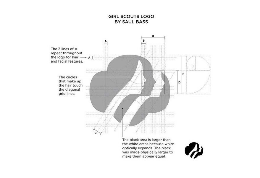
The best logos are the ones that are easy to remember, and our brains remember things that have less information. The more you can get rid of, the more efficient you'll be in conveying your message. French writer Antoine de Saint-Exupery has an excellent quote that applies perfectly to logo design.
"Perfection is achieved not when there is nothing more to add, but when there is nothing left to take away"
Keep your design simple, and your logo will be timeless.
The client was thrilled with the logo. We'd show it off proudly on his flyers.
Obviously, when I first created this logo, I loved it, and so did the client. But I was young and inexperienced. I was in need of work, and in need of adding pieces to my portfolio. I didn't have the know-how to create industry-standard designs, and I didn't have the wisdom to let my client know that what he was asking for was bad. They say hindsight is 20/20, and I'm seeing my mistakes with LASIK clarity.
I've gotten a lot better in the last ten years. I'm not making the same mistakes. Check out some logos I've designed.


